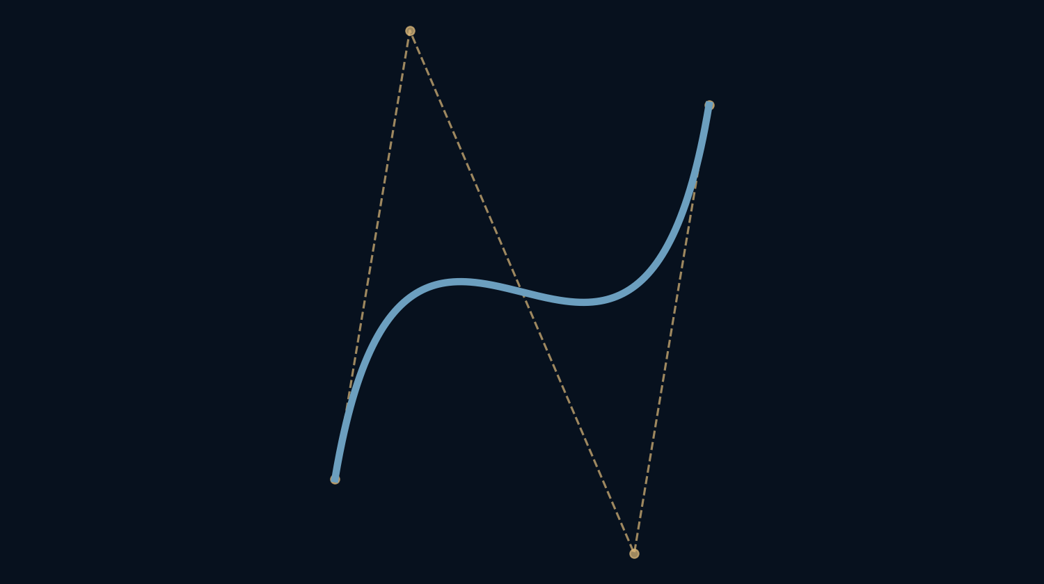
How can a letter stay smooth when it becomes the size of a building?
A curved letter is often stored as a recipe rather than a collection of tiny squares. The recipe specifies how a line should bend. A cubic Bézier curve is one widely used ingredient in vector drawing, font outlines and illustration tools. Its elegance comes from giving a designer a small number of points with very different jobs.
A handle guides a curve without sitting on it.
Two anchors, two instructions
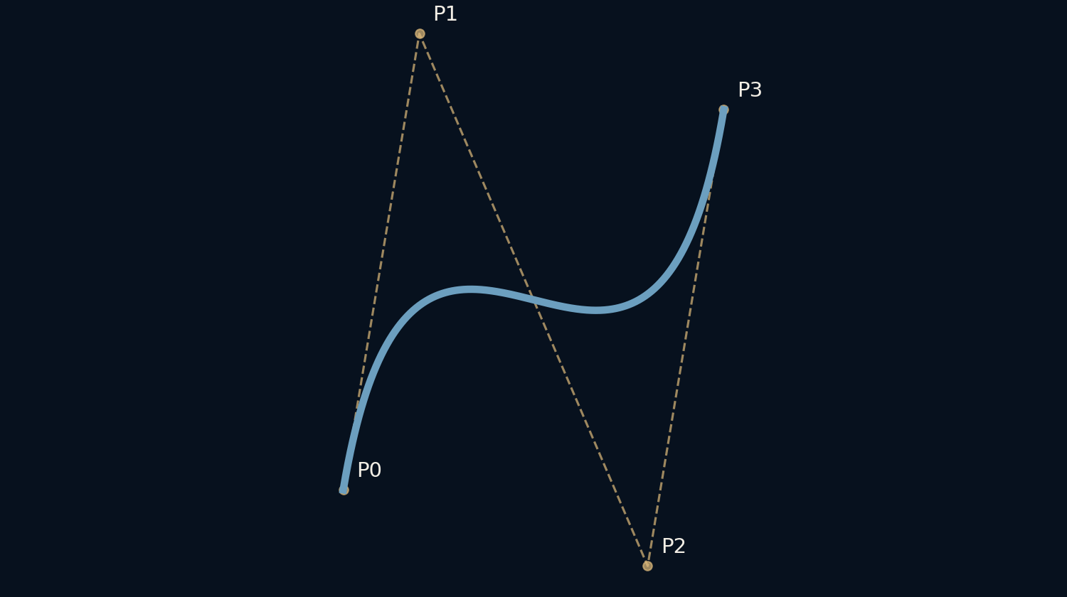
A cubic Bézier segment has four control points. The first and last are endpoints: the curve really visits them. The middle pair pull the route in particular directions. Moving one changes the entire segment, but the curve usually does not pass through that handle. This is why dragging a point in a drawing app can seem to move ink somewhere else.
Our example starts at (0, 0), ends at (1, 1), and uses handles at (0.2, 1.2) and (0.8, −0.2). Those are drawing coordinates, not millimeters or pixels. The same description can be enlarged before it is finally rendered onto a display.
Build the bend with straight lines
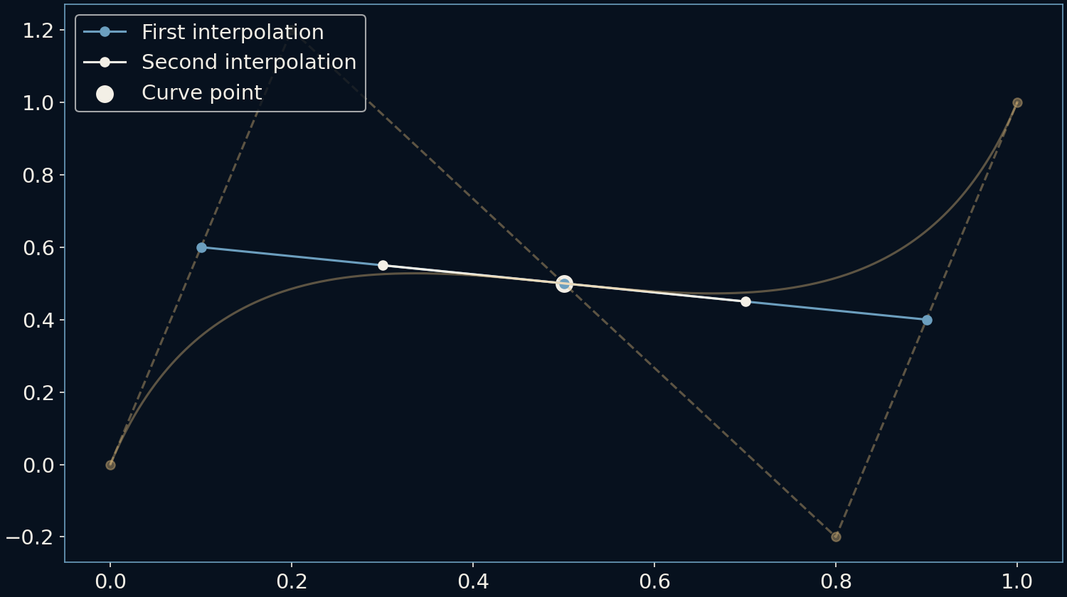
There is a surprisingly practical way to find a point on the curve. Choose a progress value between zero and one. On each of the three lines joining neighboring control points, travel that fraction of the distance. Join the three new points, repeat the operation twice more, and one point remains. It lies on the curve.
This construction is called de Casteljau’s algorithm. At halfway in our example, it produces (0.5, 0.5). Sweeping the progress value across its full range traces the bend. A complicated-looking shape has emerged from repeated straight-line interpolation, with no guesswork about where to put the next point.
The handles determine the departure
For control points P0, P1, P2 and P3 in order, the starting derivative is 3(P1 − P0): from the start toward the first handle. The ending derivative is 3(P3 − P2): from the second handle toward the endpoint. Both derivatives in our example equal (0.6, 3.6), so the curve travels in the same tangent direction at its two ends.
A derivative includes both direction and speed with respect to the progress parameter. It does not say that a pen or animated object must physically move at that speed. Equal progress steps generally cover unequal distances along a curve. Animation software may need an additional distance calculation to maintain constant motion.
A small movement has a wide reach
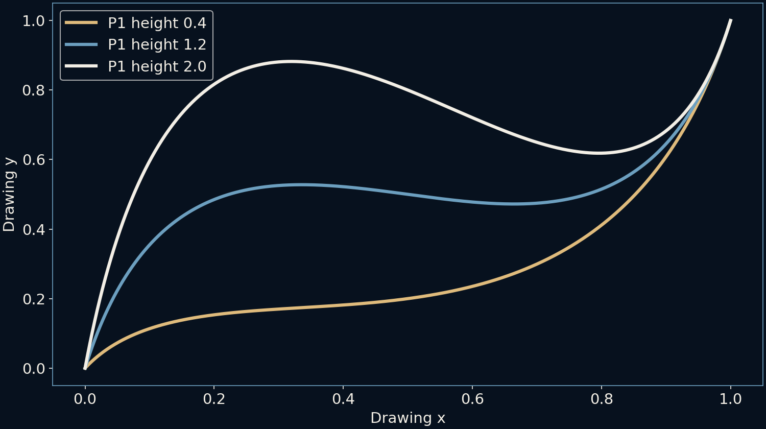
The comparison changes only the height of the first handle, from 0.4 through 1.2 to 2.0. The endpoints stay fixed while the upper part of the route lifts. This makes handles efficient for shaping a contour, but it also explains why adjusting one part can disturb another. The influence is distributed across the segment.
For more local control, designers join several shorter segments. A smooth-looking join normally requires their tangent directions to align. Matching directions alone does not guarantee matching derivative magnitudes or curvature. Different degrees of smoothness matter for different jobs: a logo outline and a machine’s motion path need not impose identical constraints.
A font is more than one curve
Letters are assembled from multiple contours, straight pieces and curve segments. Some font formats use quadratic Bézier curves with one handle per segment; others use cubic curves with two. Our construction illustrates the cubic case, not every font engine. Closed contours also need rules deciding which regions count as filled ink.
Eventually the outline meets a pixel grid. The renderer estimates coverage, applies display conventions and may adjust small-size shapes for legibility. A mathematically smooth outline therefore does not guarantee a perfect-looking tiny letter. The vector recipe preserves geometry; the rendering stage decides how that geometry becomes a limited number of illuminated pixels.
Read the recipe behind the line
The useful mental image is a small scaffold supporting a continuous path. Endpoints choose where the segment begins and ends. Handles choose how it departs and approaches. Adding more handles everywhere is not automatically better: an overcomplicated outline can become difficult to edit and can develop unintended bumps.
When a curve feels awkward, inspect the control polygon before adding points. Look for a handle facing the wrong direction or a segment asked to do too much. The visible line is the result; the scaffold often explains the cause. This is a way of understanding an editor, not a claim that one set of points is the ideal letterform.
Further reading
W3C SVG paths: cubic Bézier commands ↗Microsoft OpenType: CFF outlines ↗Original documentation and useful background.